
Designing AC Design
UX · IA · Design systems · Astro
The portfolio as a product — information architecture, a reusable design system, and production UI in one loop. Proof of hybrid UX and engineering, not just a project gallery.
Overview
Designing AC Design is the meta case study for this site: how I framed the brand, structured content, defined tokens and components, and shipped them in Astro. The living catalog lives on AC Design System; this page tells the why and how.
Problem & Opportunity
A portfolio that only shows screenshots under-sells a hybrid designer-engineer. The opportunity was to treat AC Design as a small product: clear IA, a reusable system, and UI that is both the evidence and the delivery.
Goals & Constraints
Scope stayed tight: ship a credible site and a system others (and future me) can reuse — without boiling the ocean on day one.
- Solo designer-developer — no separate design ops team
- Must reuse patterns across portfolio and product work
- Accessible hierarchy and focus states by default
- Decisions that translate cleanly Figma → Astro / Tailwind
Process
Structure first, then tokens, then components in code. Each step left an artifact the next step could trust.
Key decisions
A few choices that shaped both the site and the system — worth calling out for a recruiter scan, not a full design-ops dump.
Iterations
Early frames focused on layout and content types; later passes locked brand, type, and component behaviour in the build.
Outcome
AC Design is both the portfolio and the system that powers it — a clearer story for hiring managers and a reusable foundation for product work.
Biggest lesson: separate the catalog from the narrative — the system page shows what exists; the case study shows why it exists.
Next steps
- Fill process artifacts (IA diagram, wireframe strips, before/after)
- Tighten empty / loading / error patterns shown in the system docs
- Extend components as SwiftAir / CCES secondary flows need them
- Polish motion and focus states across key journeys
Related work
The living system, plus projects that reuse the same foundations.
 System
AC Design System
Living tokens, components, and principles — the catalog side of this work.
Explore the system → UX/DEV
CC Electrical Services
Role-based product UX where the same system patterns show up in a real app.
View Case Study →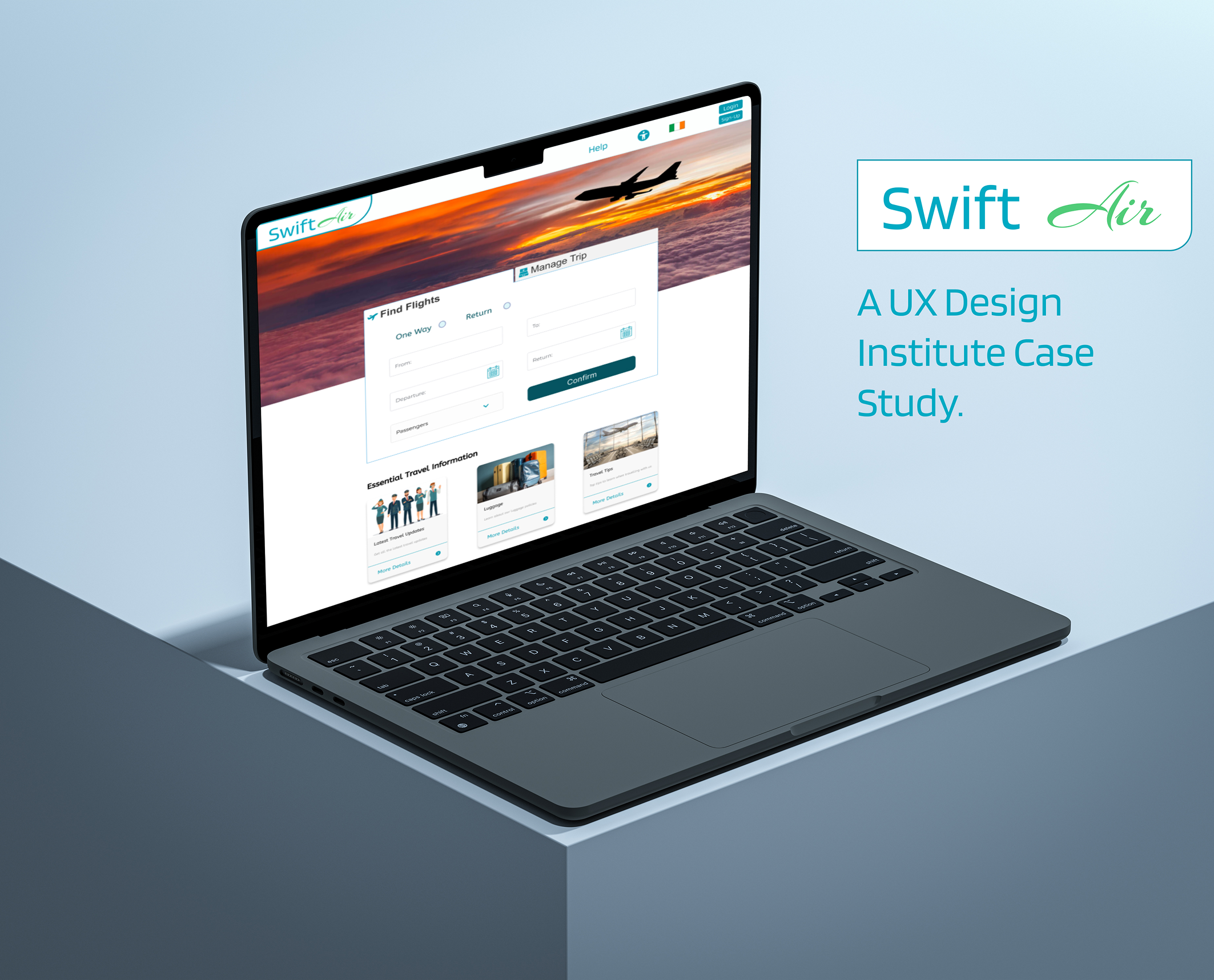 UX
UXMore details coming soon