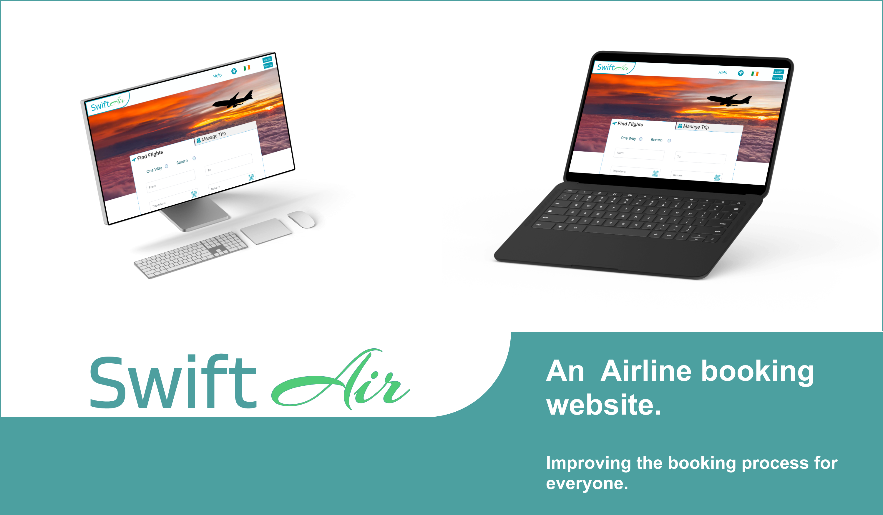
SwiftAir
Redesigned the flight booking experience for speed, clarity, and a user-centred path — booking a budget-friendly round-trip with baggage without the usual friction.
Overview
Capstone case study for the UX Design Institute Professional Diploma. End-to-end ownership from research and analysis through IA, interaction design, iterations, and a clickable prototype — scoped to a round-trip flight with baggage.
Problem
Booking a cheap flight shouldn’t feel like another trip. Existing patterns often hide cost, overload choice, or push baggage decisions too late — creating stress right when people need confidence.
What I changed
Research insights mapped to three design priorities for the booking path.
Research
Competitive review, survey input, and usability observation — enough signal to prioritise the booking path. Full boards and reports stay as deep dives.
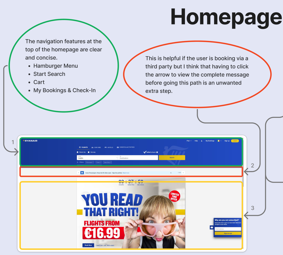
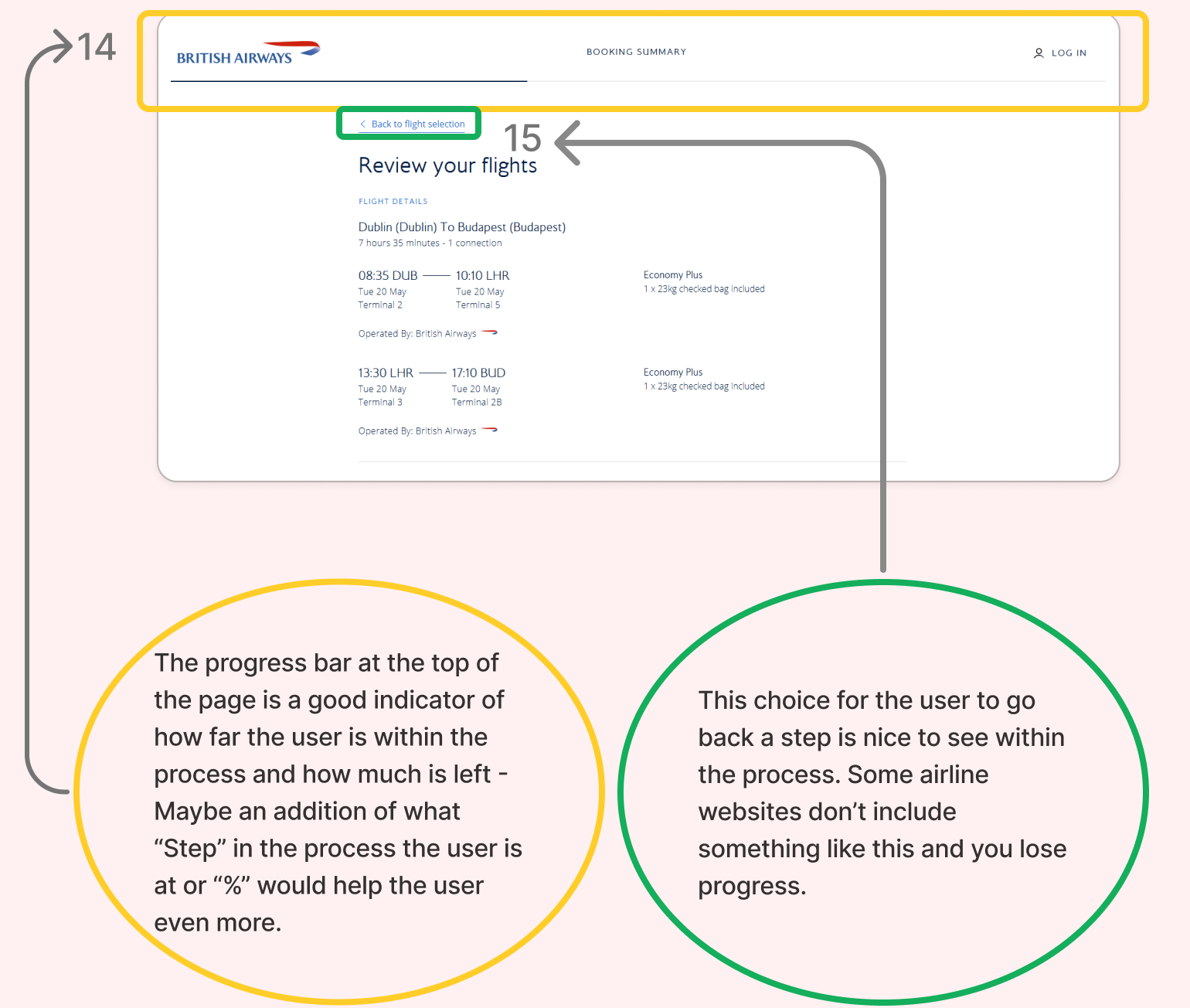
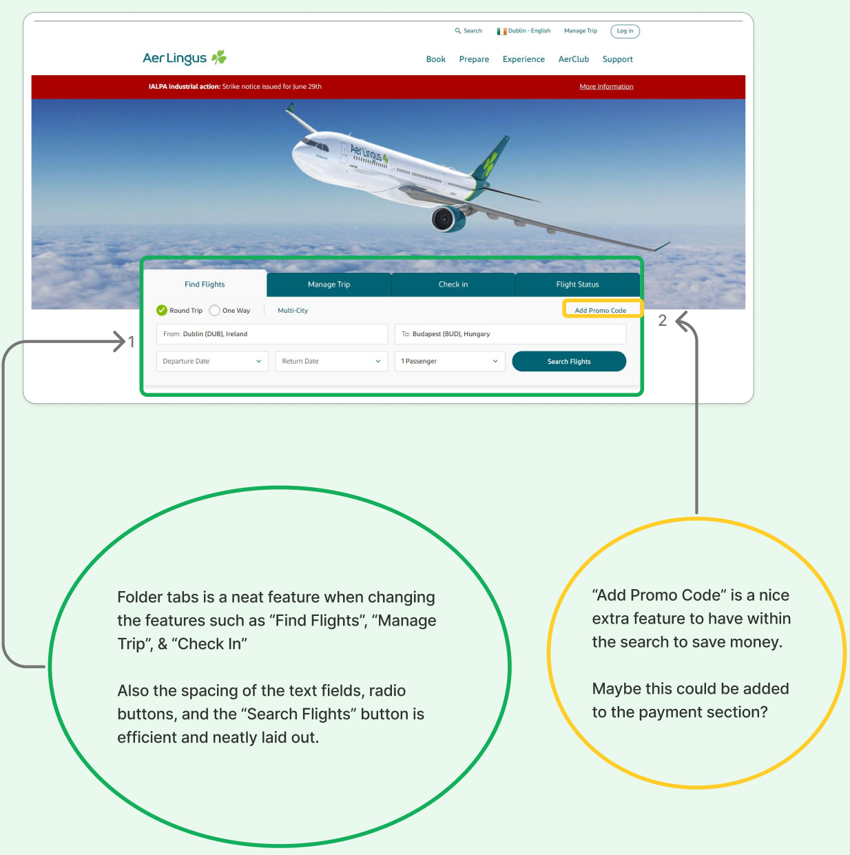
Competitive benchmarking
Compared booking patterns across budget airlines to spot where SwiftAir could reduce steps, surface price earlier, and make baggage choices less ambiguous.
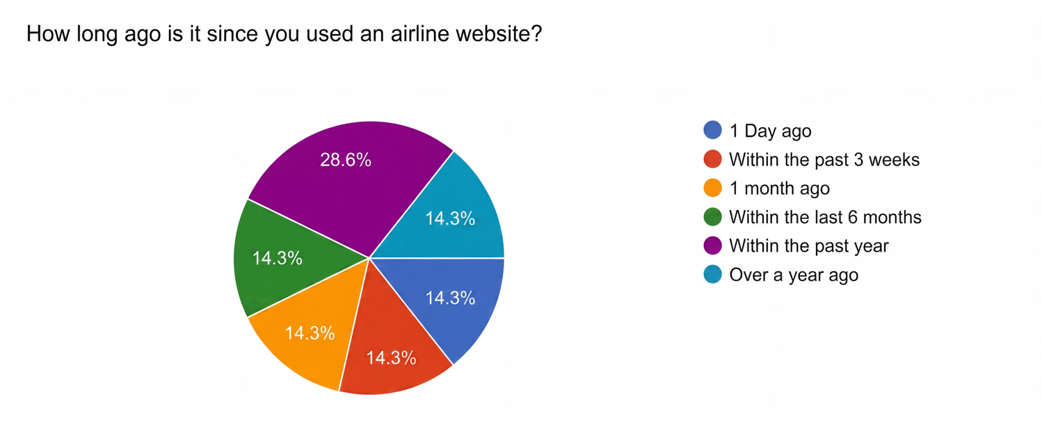
Online survey
Gathered attitudes around booking habits, baggage anxiety, and what “budget-friendly” means in practice — feeding priorities for the redesign.
Usability testing
Observed real booking attempts to find where people hesitated, misread options, or lost confidence — then turned those moments into design requirements.
Note taking & synthesis
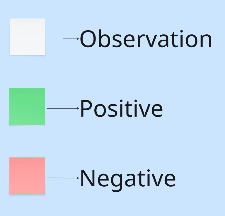
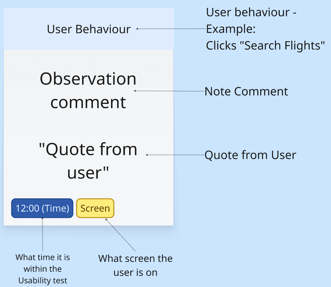
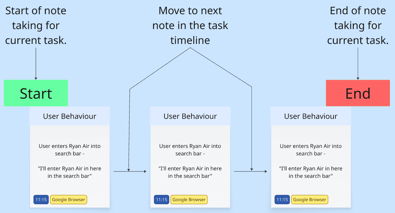
Captured session notes in Miro, then clustered themes so research stayed actionable instead of becoming a dump of observations.
Analysis
Synthesis turned raw notes into themes and a journey view — so design decisions stayed tied to real pain points, not guesswork.
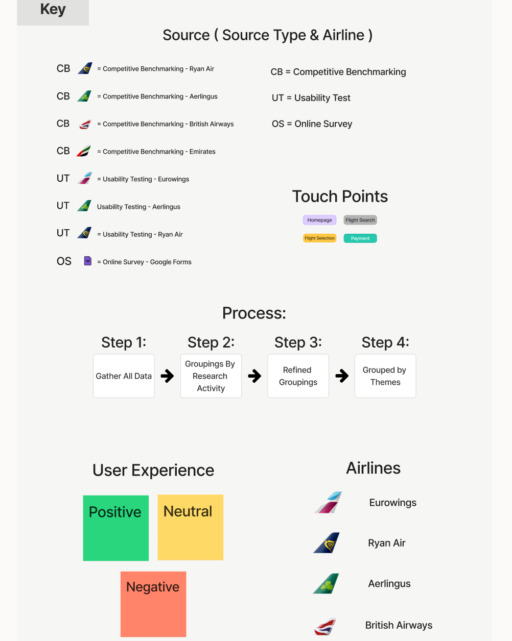
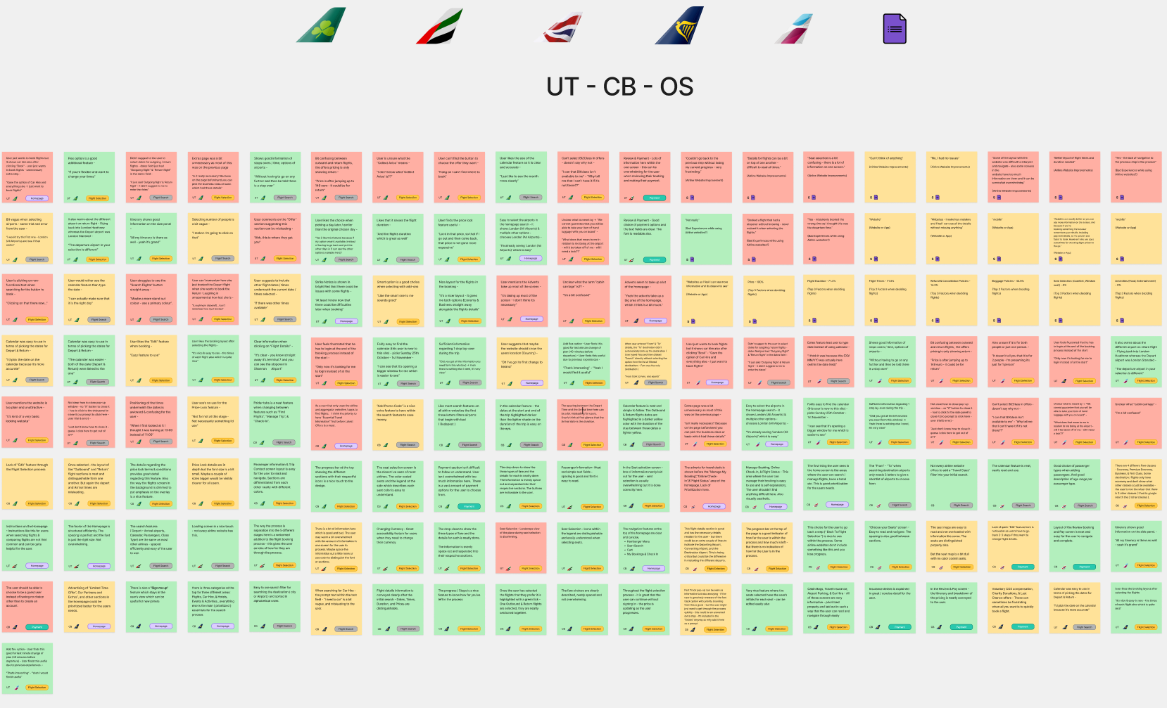
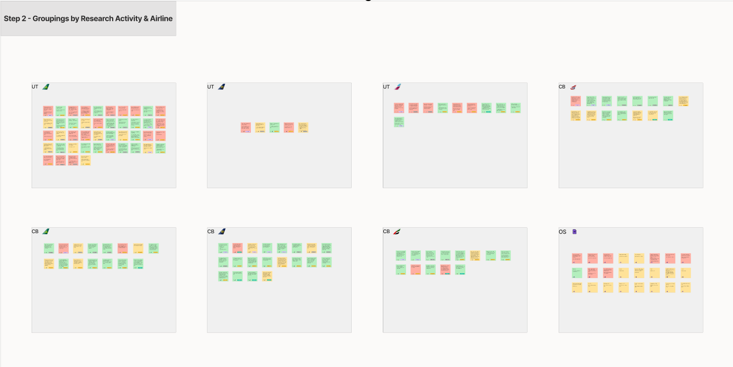
Affinity diagram
Grouped findings into themes around price transparency, baggage, comparison, and trust — the clusters that drove IA and interaction priorities.
Customer journey map
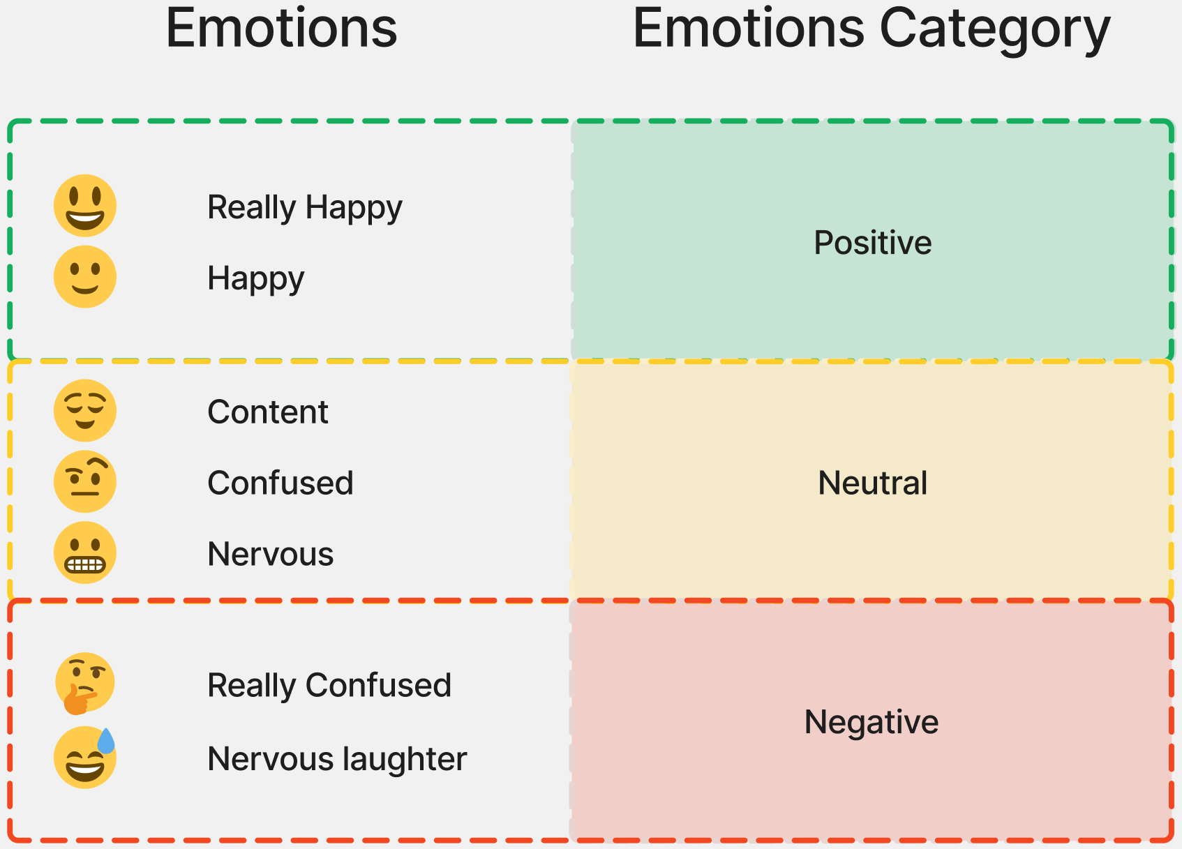
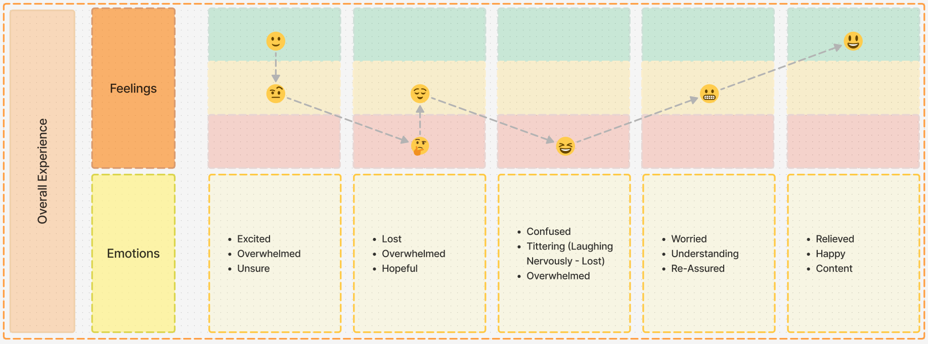
Mapped the emotional and task path from intent to confirmation, calling out pain points where the UI needed clearer next actions.

Information architecture
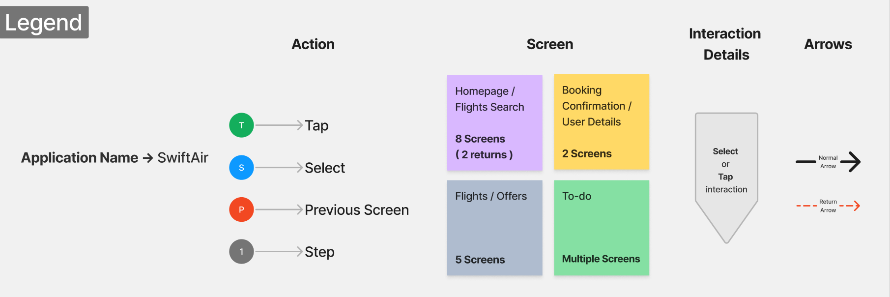
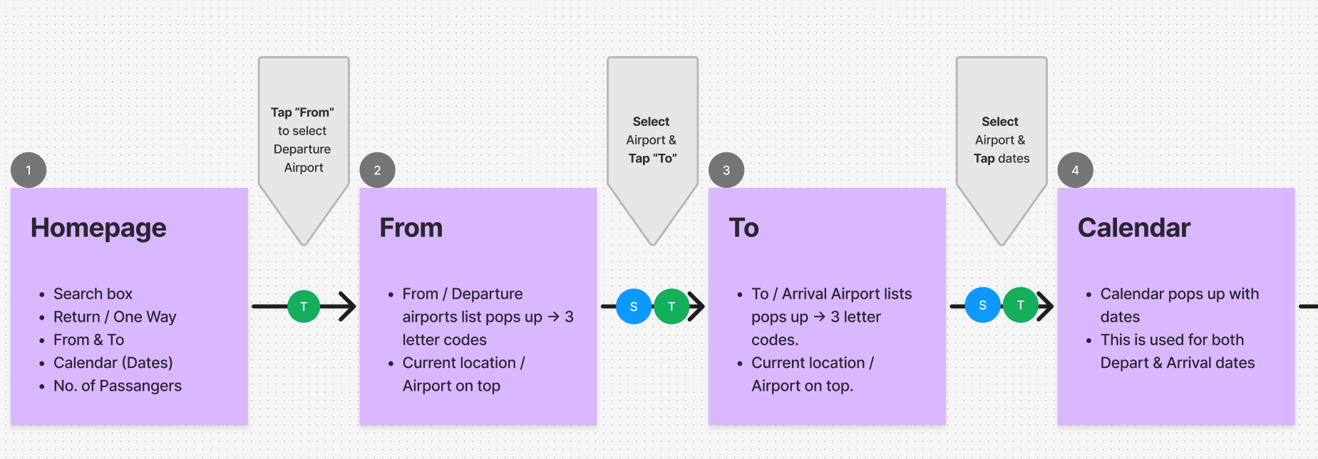
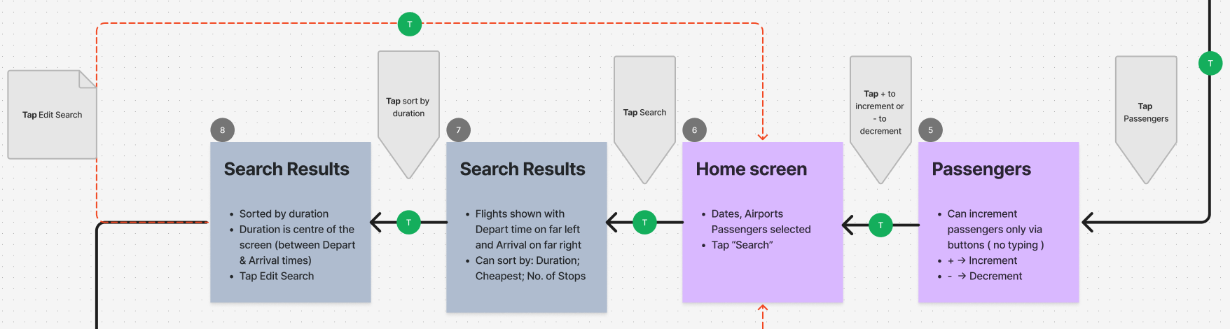
A simplified happy-path flow framed the booking sequence — search, results, flight details, baggage, and confirmation — before screens were polished.
Design
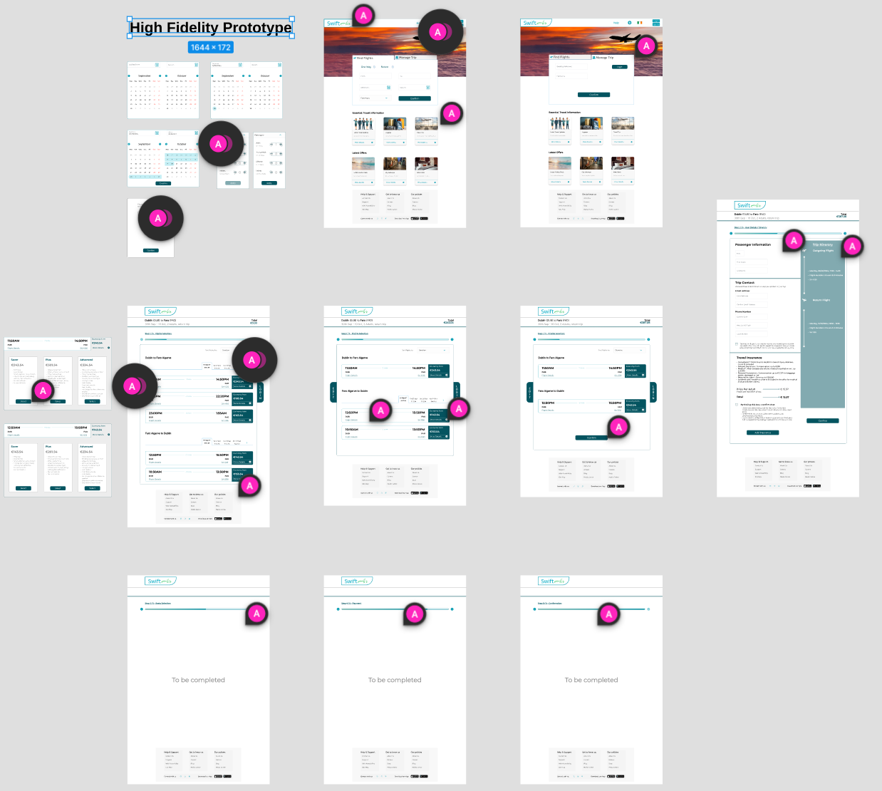
Design moved from structure to fidelity: interaction sketches, iterated UI, and a compact style sheet so the prototype felt like one product.
Interaction design
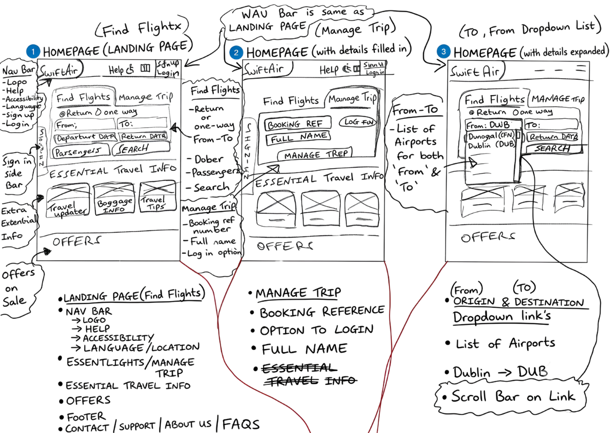
Sketched and sequenced the booking path first — search, results, details, baggage, and confirm — before polishing screens.
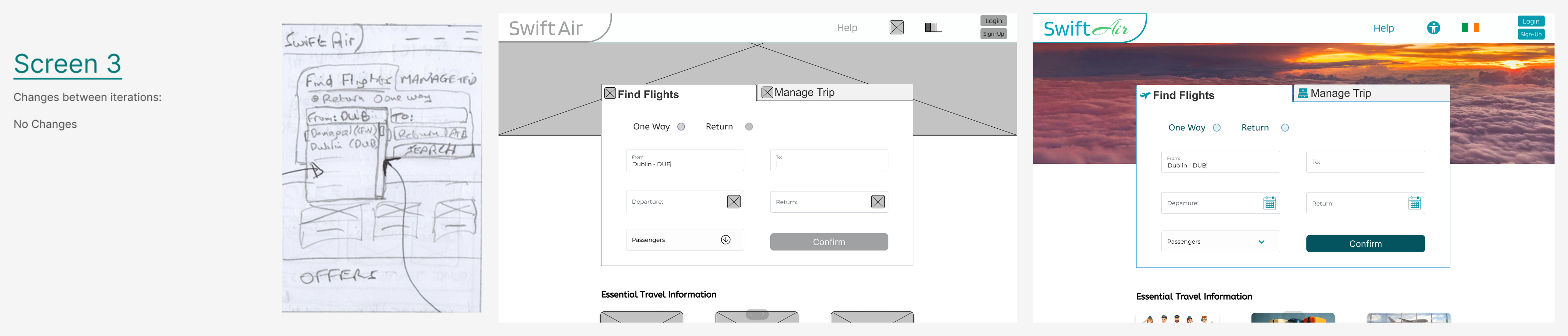
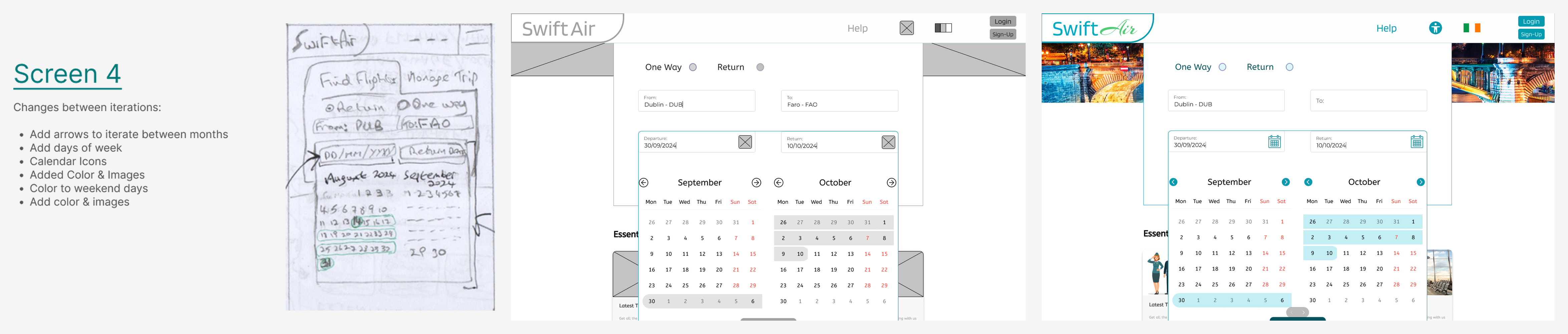
Design iterations
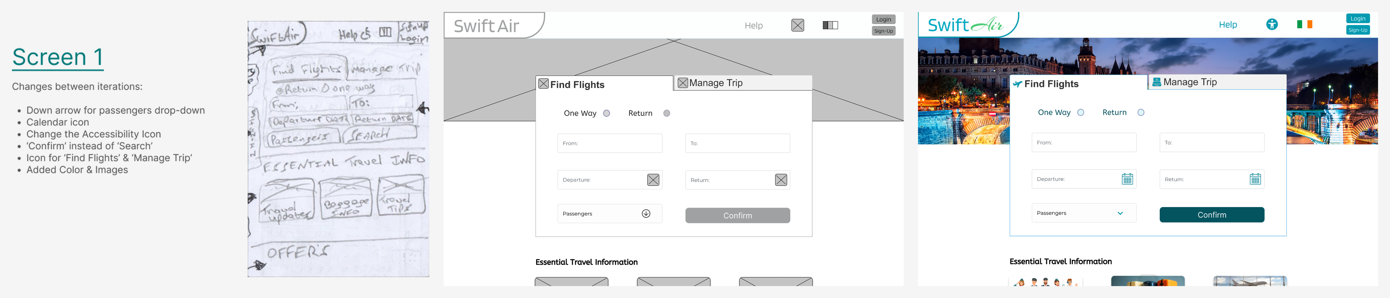
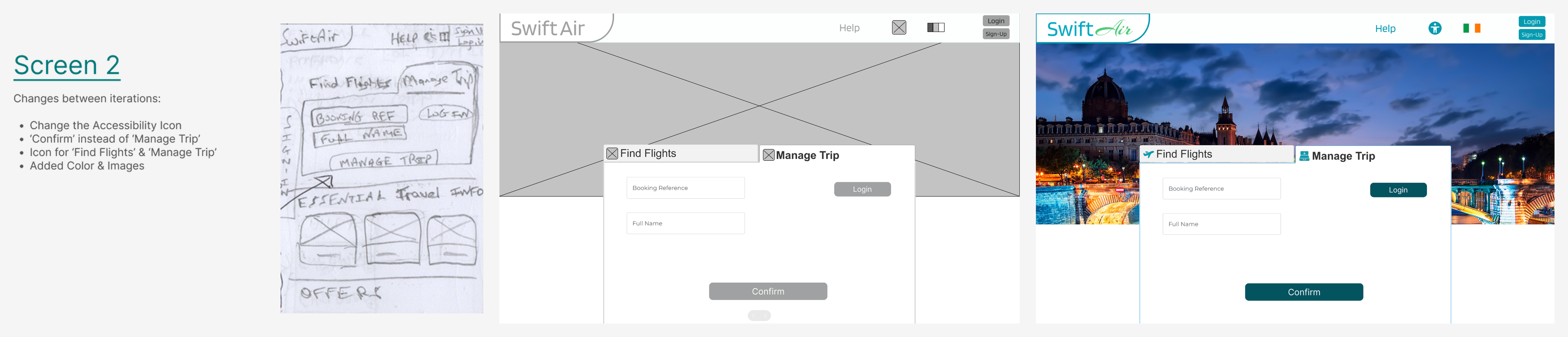
Moved the same critical screens from sketch → mid-fi → hi-fi, refining hierarchy, labels, and decision points with each pass.

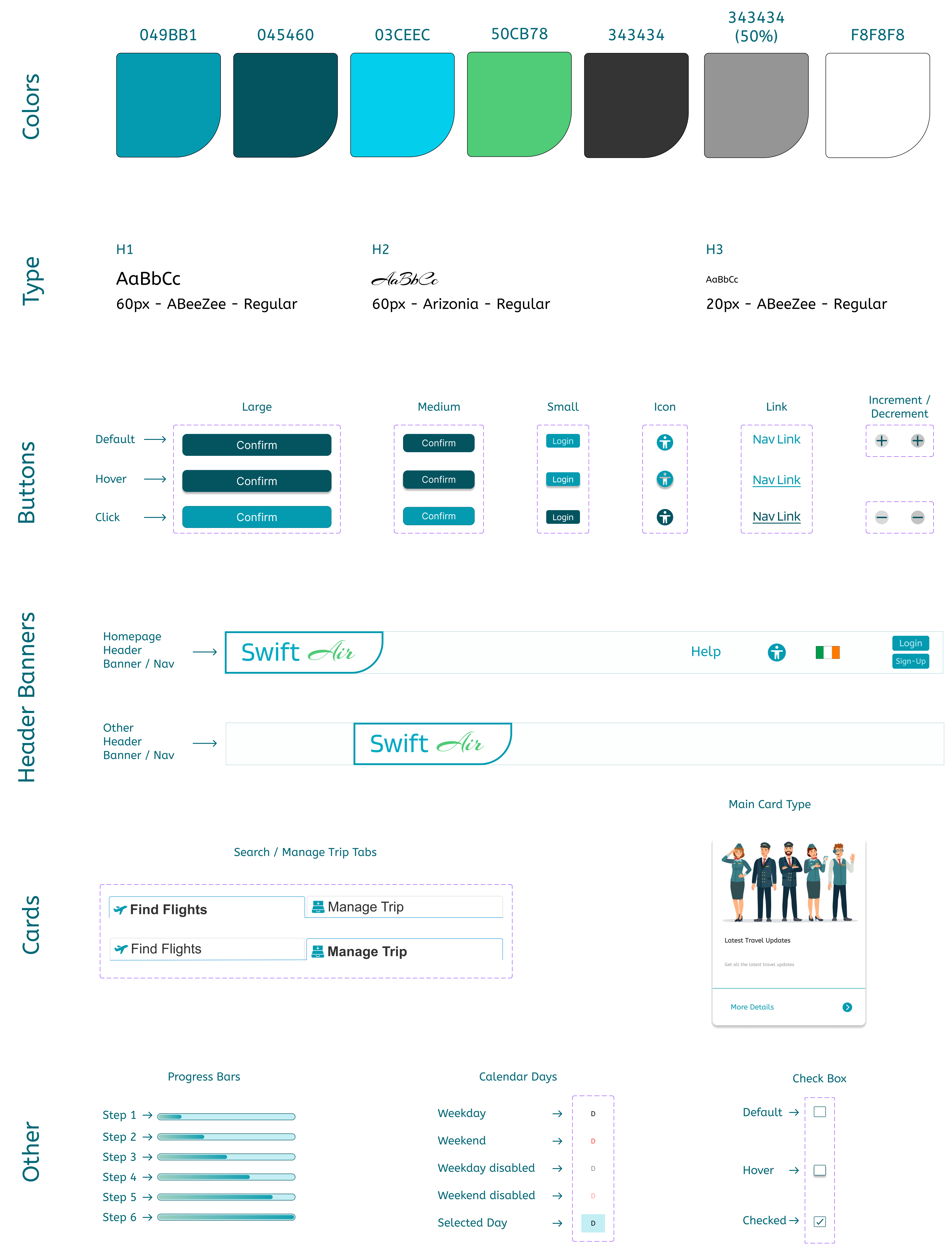
Style sheet
Defined a compact visual system for the product — colour, type, and key components — so final screens stayed consistent.
Outcome
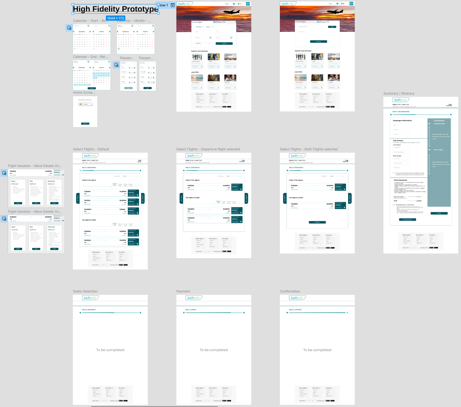
The problem was a booking path that buried choices and eroded confidence. The solution is a clearer flow — step navigation with progress, easier flight comparison, and booking prioritised over clutter — demonstrated in a clickable prototype.
Next steps
- Validate remaining edge cases (multi-passenger, mixed baggage) with another usability round
- Tighten empty / error / loading states across the booking path
- Extend the design system for secondary flows (manage booking, check-in)
Related work